Friday 26 July 2013

Film poster edits

This is a replica of the Trainspotting DVD cover, I took each image myself and and put them into black and white. I then designed the background to look like the trainspotting cover.

This is the Forrest Gump DVD cover, I have edited it to have my face on.

This is the Lockstock and two smoking barrels poster and I have edited my face into it.

Wednesday 24 July 2013

DVD sleeve and posters - development

This is the first draft of my first poster, as explained in my proposal I wanted to create two different posters in order to create synergy and 'a buzz' around the film I am advertising. I went with a simple poster which displayed only the vital information needed on a poster.
This is another version of my first poster, on this one I have slightly edited the models skin in order to give a more professional and better looking poster, I have also moved the model down slighty and made him a little bit bigger in order to make him more focal and less 'white space' on the page.
I have made the model even bigger on this draft and moved him down once again, this means the white button which was interfering with the date at the bottom of the page is now pretty much out of view completely.
On this one I have added a lens flair and a slight colour readjustment, the lens flair adds another level to the poster. I don't like this as the simple and clean poster, in my opinion, has been spoilt. However the colour adjustment fits in well with the name of the film as he is slightly pink.
This is the first draft of my second poster for 'Pink Diamond' here I have kept the simple title and date but have used a very strong filter on a different image of my model, I think this works very well as it shrouds the film in mystery.

Here I have used the paint tool to add drops of pink to the typography of the title. This also fits in with the name of the film however I think it makes the title look very messy.

Here instead of the pink paint been on the title it is on the arm of the main character, I think this works better than it been on the lettering.
Here I put the paint on both the title and on the arm of the model, I think this looks very messy and doesn't work well at all.

This is my DVD sleeve. I started by designing the front cover (right hand panel). After conducting research on other DVD sleeves of films of a similar genre I knew which important information I would need to add to this section of the sleeve, I wanted to carry the simple and clean theme going throughout the films lifespan so decided to carry it on here so I used the bare minimal information on the cover. I put the title, name of the director, pictures of the main character and the age rating. I didn't just want to use one image of my main character on the front as DJ'ing and the general theme of the film involves movement and change. Therefore I designed a three tiered look in which I separated using black boxes. I think this works very well and looks good. I next started to design the spine of the DVD sleeve, here I knew I again needed the title and an age rating. However when I had added these two features I decided to add another image of the main character. I did this because when a DVD is stacked up with other DVD's the only thing visible is the spine and I think when this film comes out the main character would instantly be loved by the audience, therefore he will be a recognizable face and will help people chose this DVD to watch. When it came to the back there are certain things you must have, these include a small synopsis of the film and the information box (white box at bottom) which includes the age rating, bar code and information about the film (running time, subtitles etc.) I also wanted to add screenshots of the film to entice the potential audience who may pick up the DVD to look whether they'd like to buy it or not.

Wednesday 5 December 2012

Typeography

we were given the task of finding fonts to go with 5 different genres.. Horror, Romance, Action, Sci-fi and Historical Drama. these are the fonts I chose and why I chose them.

Thursday 22 November 2012

20 things to do in photoshop

Invert
Adding noise
Brush tool
Dark tones
Plastic wrap
Crystallizing
Rubber tool
Mosaic
Text tool + Drop shadow
Diffused glow
Lens flare
Gaussian blur
Flip 180
Bas relief
Black and white
Make it look like a photocopy
Peppers.pdf
Motion blur
Film grain
Clone tool

Thursday 15 November 2012

Firstly we got taught the basics of editing models on photoshop, we learnt how to use the spot healing tool and other basic tools like cut, scale, move, rotate etc.

Here's my picture:


Thursday 13 September 2012

Creating an illustration in Adobe Illustrator

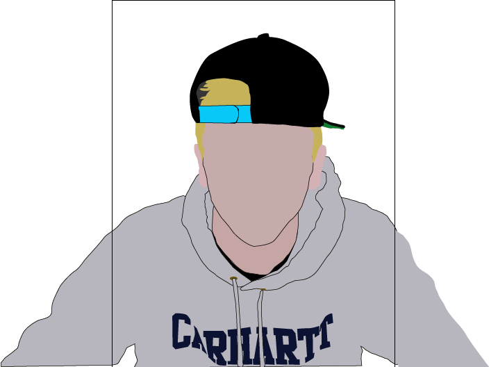
This is my final illustration.

This is the image I used to create the illustration
To get everybody used to Adobe Illustrator we were set a task of creating an illustration of ourselves, to do this I firstly used PhotoBooth to take a picture of myself I could use as a guide. I imported the image of myself into Illustrator and began to add shapes using the pen tool. I started with the basic shapes E.g. head, hair etc. You create the shapes using straight and curved lines which you can then add colour to, this makes up the illustration.  Making the smaller and more detailed features of my face however were more difficult as the shapes had to be cleaner and fit together well, I had to zoom in to do this. As illustrator uses layers, and creates a new layer for each shape or line, you can rearrange these layers and this is another thing I found quite difficult as layering the illustration in the correct order to make it look right. Getting the colours right were also hard, I used the 'Eyedropper tool' where I could (clothing etc.) but had to create my own colours on skin, hair, eyes etc as the eyedropper tool gave me a drop of colour and when the whole shape was made that colour it didn't look right. I finished off by adding a background to the illustration. I found this task fairly easy as I've used illustrator to do similar things in the past.
This is the first shape I made - my face.
I next made my hat
Then my hair
After that I created my neck
Then added the shapes making my hoody
Made ears
Added more detail to my hoody, including 'CARHARTT', the shadow between my hoody and neck and the strings.

I started to make the details on my face. Eyes, lips etc.
I added lines to make my nose and adams apple. Also an earring and the snaps on my cap.
Finally Added a background colour. 

This is the pen tool icon inside illustrator.

This is the eyedropper tool icon in illustrator.